Next forum testing
The new text box doesn't render on an up-to-date iPhone 10s running Safari. It works on an iPhone 11 in the Xcode simulator so that's fun.
Doesn't work on my aging iPad either, but it's fine on my iPod Touch, which is still getting full OS updates (not just security updates). I'm not super concerned about it but I will look into it later.
The good news is that some attacker running a variety of scripts blasted the server at 6,000 requests per minute this morning and nothing bad happened. I doubt anyone noticed.
Jeff - Editor - CoasterBuzz.com - My Blog
OK, I looked at the error and it's because of a feature that isn't supported on iOS Safari until v13, which it looks like that older iPhone (and my old iPad) will never get because they stopped at v12.5.5. That iPhone only gets 10 more months of service life, and mine gets none, so I think I'm just going to let it ride as something I can't fix since it's in the library for the text editor.
Jeff - Editor - CoasterBuzz.com - My Blog
What's funny is I upgraded to a 13 Mini today. The text box renders but I get the "Can't make an empty post" error when I click "Submit reply". The preview works.
That's weird. I just made a post from iOS 15.4.1 no problem. Next time you're on it, try tapping somewhere in white space after putting words in the box, then push submit reply. It's certainly possible that it treats touch and click events differently or in unexpected ways, because iOS Safari is the new IE11. Even when you're using Chrome on iOS, you're using Safari. It's annoying.
Jeff - Editor - CoasterBuzz.com - My Blog
I finally solved the browser caching problem with a feature I didn't know about, so I can't blame weirdness on that anymore (like the fact a lot of you probably saw the new vote buttons in blue). Always learning new things!
I'm probably going to let this build sit while I start to work through the notification bits. Also thinking about using icons for those post tools (chain link, reply arrow, quotation mark, square-with-pencil, etc). Are those universal enough to be understood?
Jeff - Editor - CoasterBuzz.com - My Blog
I connected my phone to my Mac and don't see any errors in the console. When I originally click Submit reply I get the error. If I Preview, close the preview, then Submit reply again it goes through. That's how the two test messages above were posted.
You wouldn't see an error... what happens is (if Safari implements touch and focus events right) as soon as you tap out of the box the value of the text is copied into a regular form field that is read by the code submitting the post. If it's not responding to those events, well, then nothing happens and it attempts to send a blank post.
Jeff - Editor - CoasterBuzz.com - My Blog
I know that quoting on iThings doesn't work here, but if you have one, see if you can make it work on the test site, if you don't mind. It works on my tiny iPod touch, which is the latest (for now), but I need a new iPad or something to test on.
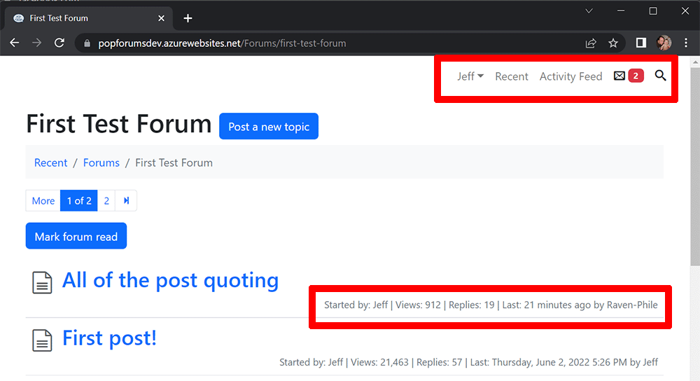
Also on the test site, as I get closer to doing notifications, I made some changes to the top navigation, in part by hiding search behind an icon, though it pops open with focus when you click on it. People don't use the PM's that often here, but the number updates in real time now. I probably need to revisit that and make it more chat-like. Thinking about revising the nav here as well, but not going to update the build here until I stop breaking stuff.
Jeff - Editor - CoasterBuzz.com - My Blog
OK, reposting stream of consciousness from my blog to this thread. If this is boring, by all means skip it. I am interested though in what regular people think.
First off, let me work through the topic list.
I've already started to revise the upper right navigation because there will be a new notification count up there, and I wanted to keep those counts and the search visible even on mobile. One thing about that is the inclusion of the recent link, which is often redundant everywhere but the home page. Some people prefer to use that as their starting point instead of the individual forums. Those folks also don't use the mark-all-read function, so they have hundreds or thousands of last-time-read records. My suspicion is that I can include a notification all-read function to be the same thing.
The other thing I've never quite found a use for is the topic stats (they appear under forums on the home page as well). These don't even appear on mobile at all, and they exist mostly because forums have had those since the beginning of time. Definitely no one cares who made the last post in a forum, and I'm not sure if they care about it in topics. I look at the reply count sometimes. I think that people may be interested to know what's "hot," but depending on the community, that could mean lots of view or lots of replies, or both. I wonder if there's a way to visually represent that.
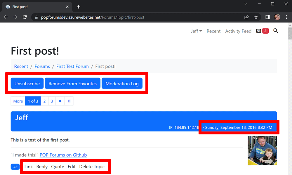
The post pages are a bigger mess. The moderation log button only appears for moderators (obvs), but the subscribe and favorite buttons seem clunky. Also, "subscribe" currently means email notification, but it'll switch to in-app notification, and users will have an option to subscribe to anything they post in automatically. There aren't really icons for these actions that follow an understood convention, let alone in six languages.
The date I call out because it does show things like "4 minutes ago" and update every minute. They count up the first hour in minutes, then say "today" or "yesterday" with the appropriate time, in all six languages. The problem is that they come from the server and depend on the user's profile time zone, otherwise defaulting to a time zone in the settings. Ideally, this would all be in the browser using the browser's time zone and I can persist the language parts in the header or something. Rewriting that will be gross though. It's 60 lines of code that I barely understand, and I haven't researched if the browser knows anything about the use or non-use of daylight saving.
The post tools I've always hated. I do think that these could use icons, something like a chain link, a reply icon as seen in every email app, quotation marks and a square-and-pencil (delete is only seen my moderators). I'm worried that these would appear even junkier than the words, and I don't know if they translate well into the other languages. No matter what, I'm thrilled with the improved post quoting.
Private messages are kind of dumb the way they're set up now, because they follow an email paradigm. It would be easy enough to just make this straight-up chat, I guess. I already converted the new message badge to be real-time, so the notification mechanism is already there. I would have to ditch titles and limit users to one "thread" per user, or groups of users.
Stats show that exactly five people use the activity feed on CoasterBuzz, and I literally know most of them. I imagine I could throw it away and keep the individual feeds on user profiles for novelty, and beyond that, the future notifications may satisfy the same curiosity.
The other thing not pictured here is the Q&A forum layout, which is better than it used to be. That's a pretty specific use case, and mostly known to people who use something like StackOverflow. We have one of those on PointBuzz, and no one ever marks an answer as "the one," which could be a UI problem or people don't care or both.
Jeff - Editor - CoasterBuzz.com - My Blog
New test build tonight moves date/time formatting to the browser instead of asking the server to do it once a minute. It also takes care of time zone adjustments, so I'll be eventually removing those entirely from the profile. It's crazy that after all of these years the browser can even compensate for DST, though they just got to that point around three years ago. Huge change, so a lot of work to test it all. Most people will never know the difference (unless you travel a lot), but I'll know. 🙂
Jeff - Editor - CoasterBuzz.com - My Blog
Sorry if it was covered already, but I haven't been keeping up with this topic closely.
I like the "select text" for quoting, but is there a way to select more than one bit of text? See PagodaGiftShop's WDW TR. I wanted to quote two sentences separated by a lot of stuff I didn't need.
I tried highlighting one, then highlighting the other while holding the CTRL key, but that didn't work. I ended up just kickin' it old school and quoting the whole thing and deleting the parts I didn't need. Did I miss something, or can you only quote consecutively?
Hi
Or highlight the whole range, and delete the bits in the middle in the text box.
Is anyone else on an iOS thing having a problem where it says "can't make empty post" other than Andy?
Also, would like feedback on the above stuff if you have any. Also also, go to the test site and make a post and see if your times appear correct after an hour, meaning they're magically adjusting for your time zone.
Jeff - Editor - CoasterBuzz.com - My Blog
You must be logged in to post


